 The 13th of June in Bournemouth University’s calendar of theFestival of Learning was dedicated to visual communication. Aimed mainly at people working within the third sector the workshop which my colleague Anna Feigenbaum and I ran challenged participants to think about creating images that stick on a shoestring budget.
To make the challenge more manageable and the learning wider, asthma we introduced the participants to some notions of semiotics (here’s a great resource for beginners from Daniel Chandler) and asked them to think about the direct and hidden messages of images. Using the notions of denotation and connotation and the elements of meaning (text, audience, contenxt, intertextuality and anchorage) we then proceeded to analyze several case studies including Bournemouth’s own Yellow Busses promotional materials and some of BU’s own Festival of Learning brochures.
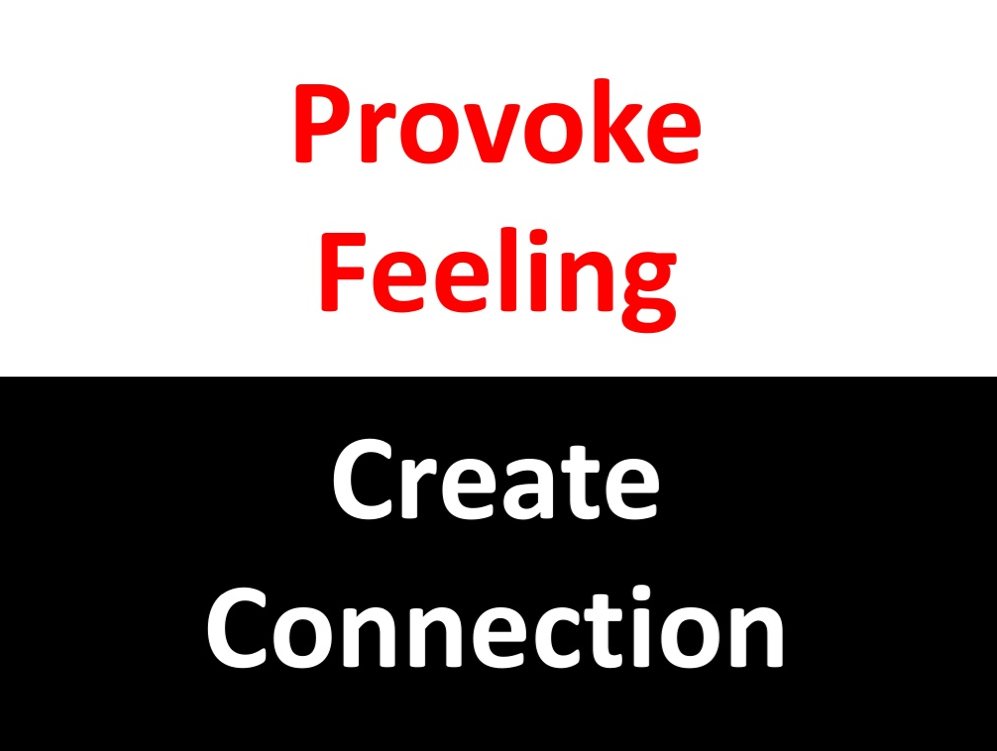
Provoke Feeling – Create Connection
The central point of the workshop was that images need to provoke feelings and to do so they need to incentivize people to create connections either by disrupting the traditional associations or by supporting them. Protest and advocacy groups are particularly good at proposing new associations by disrupting the current ones, Reporters Without Border’s poster of the Beijing 2008 Olympics (see here) or the unidentified poster next to it being good examples.
For a more comprehensive analysis of “visual resitance” check Daria S. Kempka’s MA.


To achieve that the visuals created should be location specific, provoke through bold images and speak directly the the audience. Usually, the best solution is to keep copy to a minium using it as a connector/caption to the image created. The “wordy” poster above breaks that rule but it’s aim is to capture attention through the association between the colors and fonts associated with the Olympics.
To keep costs to a minimum a good idea would be to have a mood book, or something similar to a brand book. Here’s is Skype’s brand book and Occupy London.
For everything else, the visual needs to connect with the organization and/or the cause is aimed for hence provoke feelings, create connections.