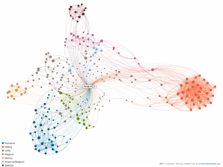
A LinkedIn picture or the beauty and challenges of visualized data for researchers
These days we are innundated with data. Every question we have is a query. Every answer we give is an input, web a result. What we know or what we want to know is, sale in a way or another, searchable. More recently, we ourselves ARE data. Our visit to a website is a number […]
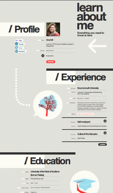
Update The visual CV platform arena is getting more competitive. After Vizualize.me generating CVs as infographics based on LinkedIn data, two more platforms are currently offering the same features: CVgram.me and Zerply. CVgram imports data from LinkedIn and enables editing when to it comes to linking skills with particular jobs. Zerply, on the other hand, […]
Some weeks ago I wrote a post about vizualization tools focusing on what could be useful for quantitative and qualitative researchers alike. I have mentioned then that my favorite was IMB’s ManyEyes platform. An update to that post is needed but this time I’ll be focusing on chart and diagram making applications. Below is a […]
Over the past few months, this web I have come across a series of visualization options for new media research and not only. My favorite right now is ManyEyes, buy more about a platform powered by IBM, that offers plenty of visualization options for both qualitative and quantitative data. What you do: upload your data […]