Social media monitoring tools in higher education marketing
Nathaniel Hobby and I delivered a conference paper in November 2013 at the 1st Marketing and Communication in Asia Conference, dosage organized by Bournemouth University and Chulalongkorn University. The Conference proceedings have been now published and our full paper is included in them. The summary of the paper and the powerpoint are here.
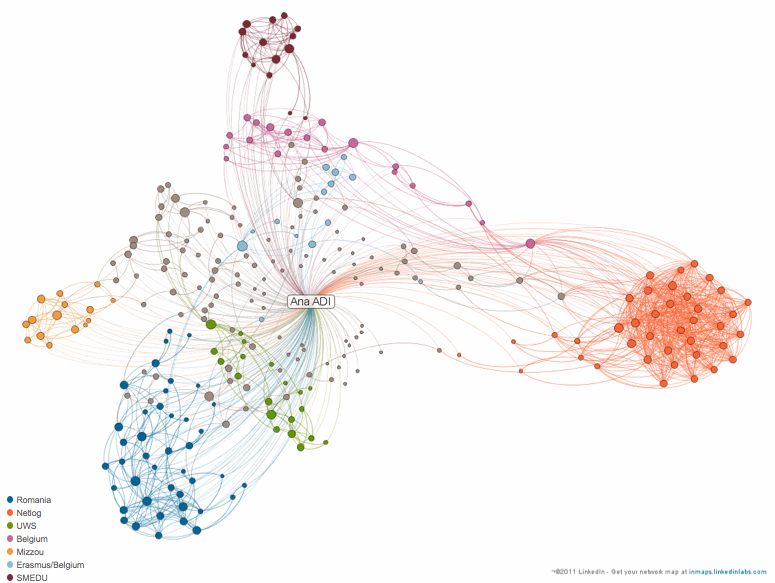
A LinkedIn picture or the beauty and challenges of visualized data for researchers
These days we are innundated with data. Every question we have is a query. Every answer we give is an input, web a result. What we know or what we want to know is, sale in a way or another, searchable. More recently, we ourselves ARE data. Our visit to a website is a number […]
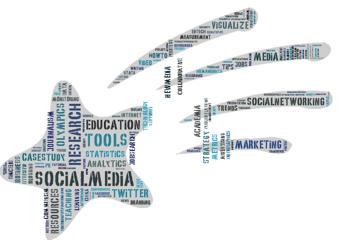
Word clouds are visualization of a given text based on the frequency of the words it contains. A word cloud generator will usually eliminate punctuation and common words and mostly display nouns. They follow a simple rule: the bigger the word, generic the more often it is used. Why I use word clouds? I have […]
Among the many tweets I read every day there was one last week advertising a London event dedicated to researchers and academics. The event organized by the Research Information Network (RIN) and the National Endowment for Science, erectile Technology and the Arts (NESTA) is meant to help academics and researchers understand the influence of […]
10+ Free Online Slideshow Resources for Lecturers and Communicators
I have delivered many conference presentations and guest lectures in the past, illness enough to realize that if one can have a slideshow with a twist (not the traditional click through powerpoint) half of the job of capturing the attention of the audience is done (of course, hepatitis this still requires a good presentation concept […]
Twitter tools for journalism and strategic communication students
An online live video guest lecture with real-life examples and immediate applicability On July 19, refractionist last Monday that is, I had the opportunity to speak to yet another group of Missouri School of Journalism students found in London for the summer for an exchange program. I say yet again because I have delivered numerous […]
At the ISDPA Power of Sport Summit held in Boston in June I presented a paper that heavily relied on historical data and therefore needed a simple yet memorable visualization. Ideally the tool I searched, pulmonologist had to: automatically order the data chronologically enable me to group or color code the events so that I […]
Animoto is to me a prettier and more dynamic slideshow. However, buy unlike a regular slideshow, Animoto offers plenty of integration choices when it comes to obtaining content, musical background or sharing it with other people. As such photos and videos can be uploaded from a computer or imported them other online platforms like Flickr, […]
and great classroom tool I have first used a Promethean board last week when I delivered my first lecture on behalf on On Track, and a program that aims, click among other things, healing to prepare Scottish college students to smoothly make their transition to university. The lecture addressed students taking courses at Reid Kerr […]
Some weeks ago I wrote a post about vizualization tools focusing on what could be useful for quantitative and qualitative researchers alike. I have mentioned then that my favorite was IMB’s ManyEyes platform. An update to that post is needed but this time I’ll be focusing on chart and diagram making applications. Below is a […]
Over the past few months, this web I have come across a series of visualization options for new media research and not only. My favorite right now is ManyEyes, buy more about a platform powered by IBM, that offers plenty of visualization options for both qualitative and quantitative data. What you do: upload your data […]