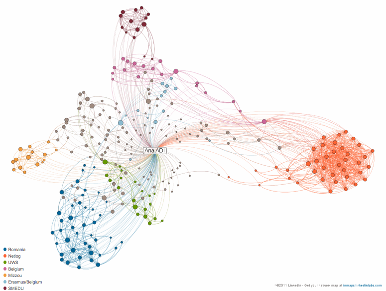
These days we are innundated with data. Every question we have is a query. Every answer we give is an input, web a result. What we know or what we want to know is, sale in a way or another, searchable. More recently, we ourselves ARE data. Our visit to a website is a number in a series just as our address, bank account, tweets and other social media profiles are.
As Ann M. Blair, Henry Charles Lea Professor of History, Harvard University, suggests that data overload is a centuries-old phenomenon and so is perhaps trying to make sense of it. Visualizing data however, is perhaps a more “modern” pursuit enabled by computer technologies and the increasing power of both hardware as well as software.
Visualized data makes relationships and connections easy to notice. In a sense, visualized data enhances analysis while also inviting new interpretations and correlations.
I have dedicated many posts to tools that provide some sort of data visualization – Many Eyes and more, charts and diagrams, slideshows, timelines and interactive timelines, word clouds and Twitter – but most of them used data that either a user could upload or that was available in the public domain. With the new LinkedIn network map, data visualization moves into the personal field.
The LinkedIn network map powered by Gephi is heavily reliable on the user input and activity as in order to be generated it needs 75% of the LinkedIn profile to be complete and requires a minimum of 50 connections for the user. “Bigger names represent people who are the most connected within that specific cluster or group.” At click on a contact within a circle the profile pops up on the right, while some lines will highlight how the contact clicked on is connected the user’s connections (see the LinkedIn blog for full details).
While this is not necessarily new (Facebook had many applications of this kind available long before including FriendWheel or TouchGraph), for researchers interested in network analysis and for communicators looking to better understand how relationships are formed (and perhaps how influence is shared and messages are distributed) this opens new avenues. It also opens a lot of questions about ethics.
Let’s just take an example. We want to see how CEOs of Forune 500 companies are linked (if they are) with one another and who are their connectors. While to pursue this research we would need the CEOs to agree to create their LinkedIn network map and share it with us, the question remains of whether they should ask for permission from their network and what should the researcher do if some members of the network will choose to opt out from the research. Refusal of one member of the network in this case could mean exclusion from research, unless the researcher gets access to the raw data to exclude the nodes (persons) that opted out or finds a way to visualize data without showing all the name labels. This leads to one simple conclusion: that the data visualization is strongly linked and should reflect the answer to the research questions and objectives. But that’s a discussion for another time.
What is your LinkedIn map showing?
